 Tech News code
Using National Rail’s vast Darwin Data Feed, Raildar has created maps that plot trains as they move across the network
Delayed trains are bad enough but being stuck on a platform with little information about the cause of the delay, or where your train is, makes the situation significantly worse.
Thankfully, like with most things nowadays, data has come to the rescue. Using National Rail’s vast Darwin Data Feed, Raildar has created mesmerising maps that plot trains as they move across the networks.

The data feed is so comprehensive, National Rail describes it as the official “train running information engine” and beyond the location of trains, it reveals real-time arrivals and departures, delay estimates, platform numbers and more.
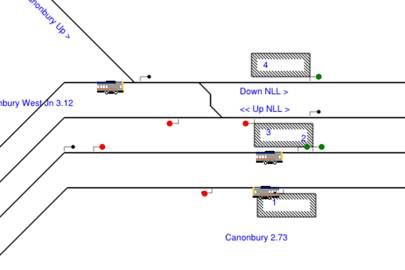
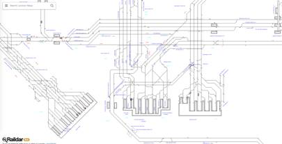
Raildar’s Junction Maps launched in 2014. It shows where trains are in real-time across the country with the ability to see them moving. The absurdly detailed, but simplistic, maps show every platform at train stations around the UK, different lines, and connections. For example, around London’s St Pancras and Euston stations the lines and signalling points are all named, including service lines and tunnels.
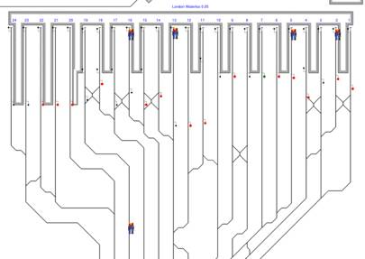
At times the map is slightly jerky with trains jumping a few places at once because it’s still in beta. combined with the specific data from National Rail, it is possible to see where the train is going to and has come from.
Click on a train to see every stop it is due to make, the precise time it stopped at each location (to the second) and the number of minutes it was delayed. The train’s name, number and service provider is also shown. We discovered that the 12:54 Kings Lynn to London Kings Cross on March 2, called G45721 and operated by Govia Thameslink, arrived at its destination two minutes late at 14:37:17.
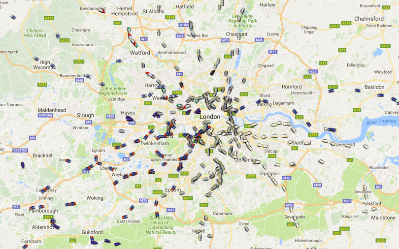
As well as the basic line view of trains, there is also the option of overlaying the real-time movement of trains over a Google Map. When shown in the map view, trains don’t move as quickly as in the stick-line view, but it is possible to see clusters of trains swarming like ants.
In a nice touch, each of the trains has been given the visual appearance of the train company it belongs to: Virgin trains all look like small red bullets and those from East Midlands look like green rectangles. Southern trains, are probably delayed.


